Project 1: Building Awareness


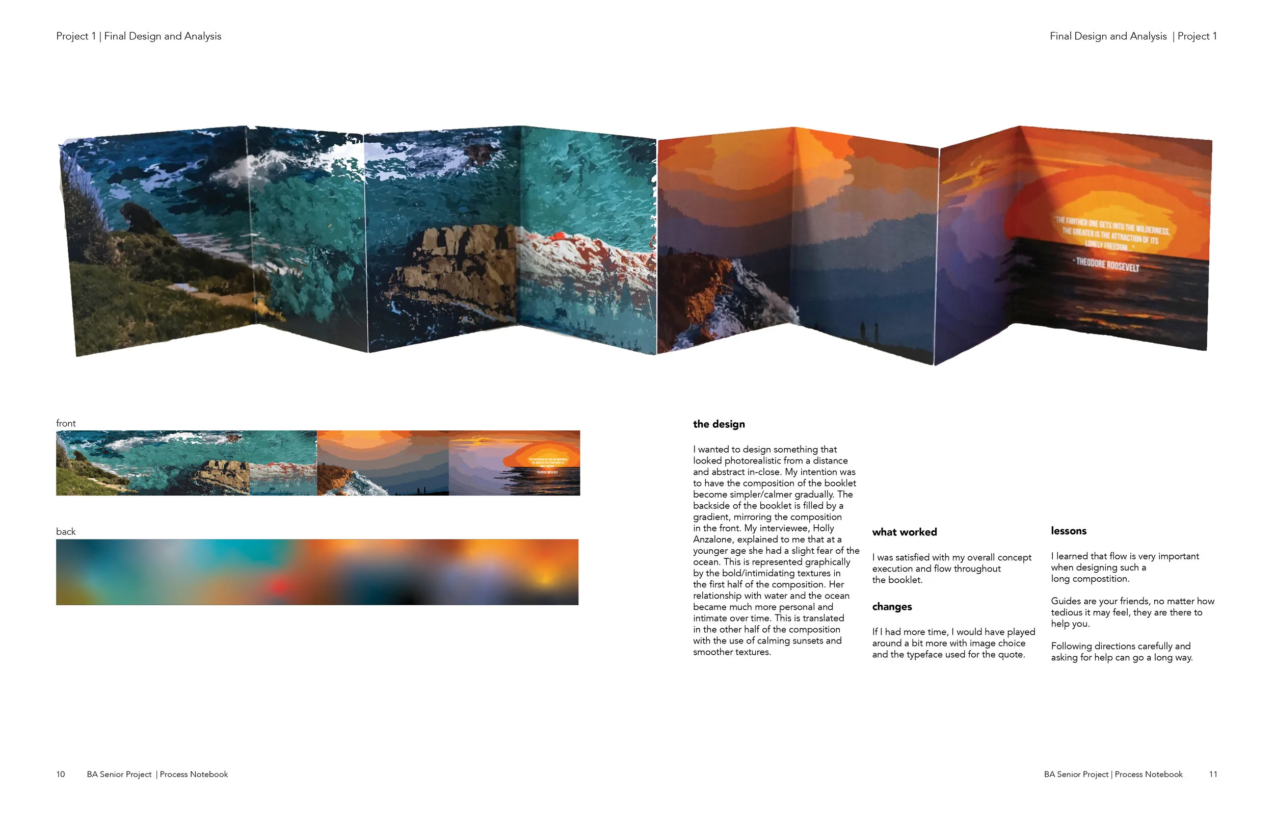
Front side of the booklet. Graphics based on interviewee’s relationship to nature.

Back side of the booklet. Gradient representation of the front design.
the design
I wanted to design something that looked photorealistic from a distance and abstract in-close. My intention was to have the composition of the booklet become simpler/calmer gradually. The backside of the booklet is filled by a gradient, mirroring the composition in the front. My interviewee, Holly Anzalone, explained to me that at a younger age she had a slight fear of the ocean. This is represented graphically by the bold/intimidating textures in the first half of the composition. Her relationship with water and the ocean became much more personal and intimate over time. This is translated in the other half of the composition with the use of calming sunsets and smoother textures.
Project 2: Discovering the Relationship Between Design and Human Experience

the design
Calling Intention: How can I inspire connections with humanity to create accepting environments and oneness with the Earth?
Pattern: Branching/Fractal
This design was inspired by the similarity in appearance between human brain cells, tree branches, and the expanding universe. Trees are representative of life itself. They are rooted deep into the Earth and provides humans with breathable air... the essence of life. This automatically connects humans to nature, as we depend on it for its resources. The Earth is connected to the universe in the endless void of space. Our consciousness can grow if we can draw the connection between ourselves, nature, and the universe.The orbs of light in the composition are symbolic of the connections made between neurons in our brains, but they can also symbolize different galaxies in the universe.
There are twelve orbs of light to symbolize the twelve months of the year. 2021 is found in the bottom left-hand corner of the composition.
Project 3: Leveraging Your Callings Into Organizational Intentions


the design
Front/Back Cover
Clear, clean water represents New Life’s ultimate goal of a clean, plastic-free ocean. This is visually translated in photography on the front and back cover. The photo used is symbolic of the clean water that our artifact provides through filtration.
I wanted to let the form/lines of our logo to blend in with the textures of the ocean. Using the line vector instead of the original logo with color allows the logo to breathe and let the textures of the ocean become the fill.
NewLife group members:
Angel Espinosa
Cristian Gonzaleaz
Sebastian Honigs
Dustin Yoo
Mona You
Project 4: Design Process Notebook


the brief
My final design project was to create a notebook showcasing my creative process through the previous three projects. The notebook required: front/back cover design, table of contents, all three projects, business card/resume, and class intentions. This notebook was created and completed in InDesign.